Case study: managing your loan by mobile
NatWest mobile app
Enabling customers to self-serve their loans
The existing experience for NatWest loans customers needed updating: getting a repayment quote or even finding out your balance required filling out a form and waiting for a letter in the post. Customers knew it, and responded by giving the bank the lowest NPS score among it’s peers.
The ask was to bring new functionality into the NatWest mobile banking app for customers to be able to view and manage their loans, instantly and effortlessly. This would keep customers informed and empowered, and reduce the burden of the bank needing to process customer requests manually.
An initial workshop with stakeholders got us all aligned on the perceived problems, and objectives for the project.
Here we agreed an initial set of prioritised features to explore, understanding why these were important to the bank. We could then compare these with the needs of actual customers.

Formative research gave us some insight from customers: what their habits were, issues and pain-points that they ran into, and their mindset, e.g. the ways in which they would try and perform different actions.
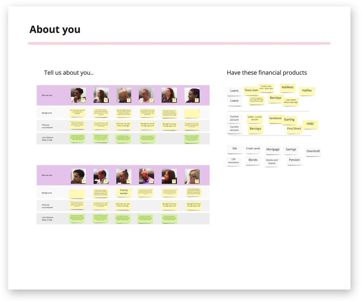

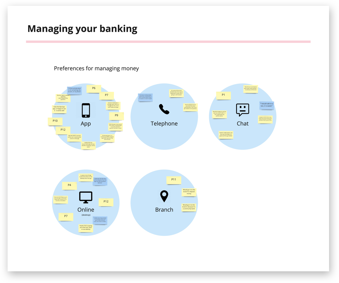
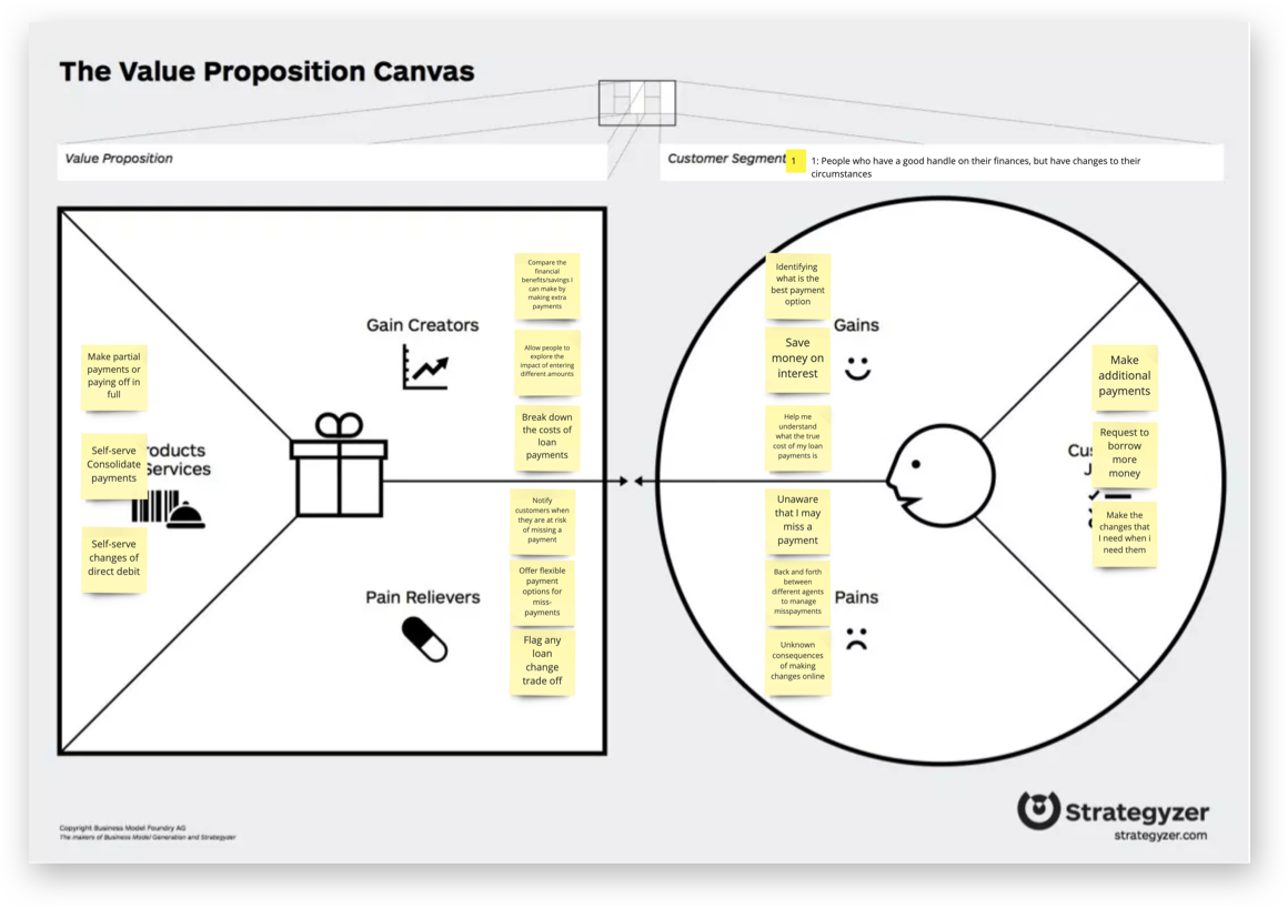
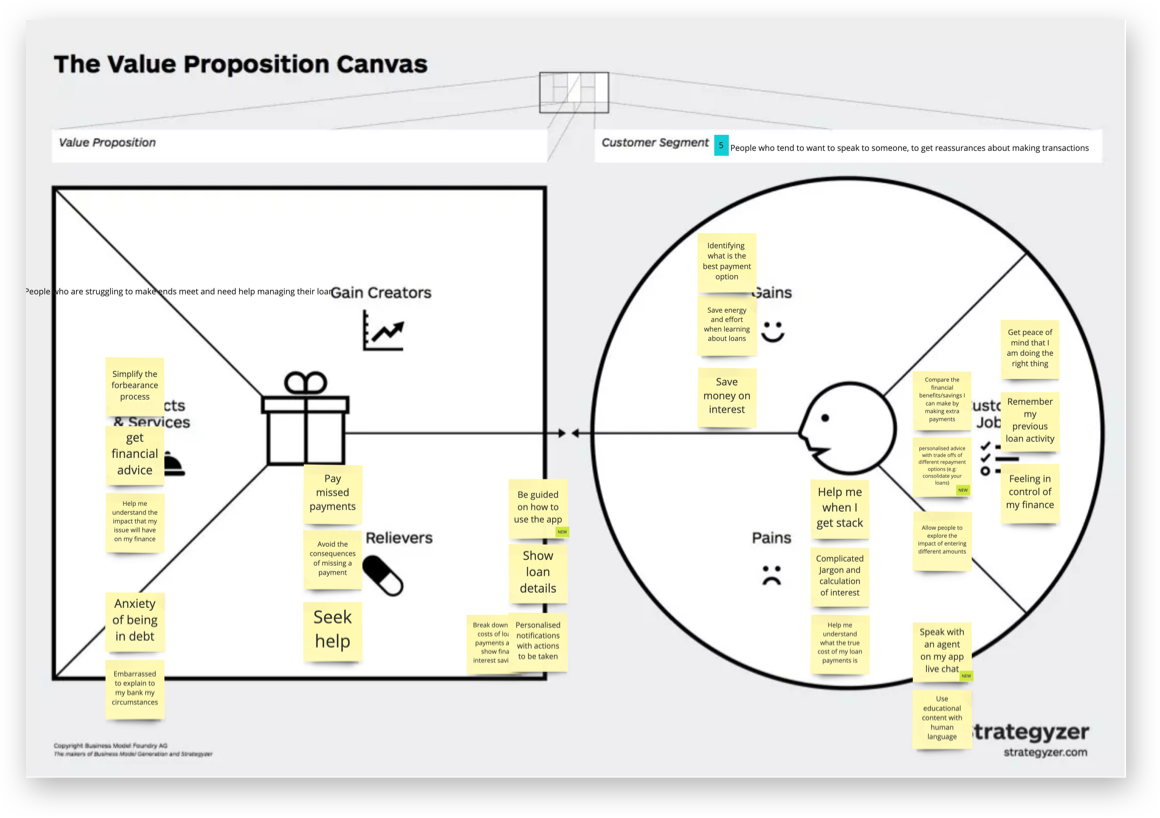
We then built out a value proposition canvas for some hypothetical profiles we built from our findings so far combined with existing customer segment data.
Storyboards of different customer scenarios helped to illustrate to stakeholders what the experiences of customers were, and what they could be.


Design blueprints mapped customer touchpoints for each feature, and the back-end services required to make them happen.
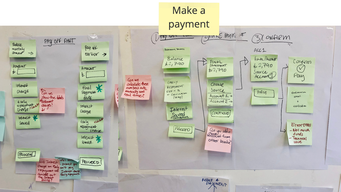
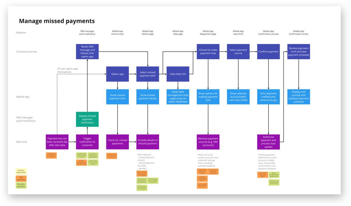
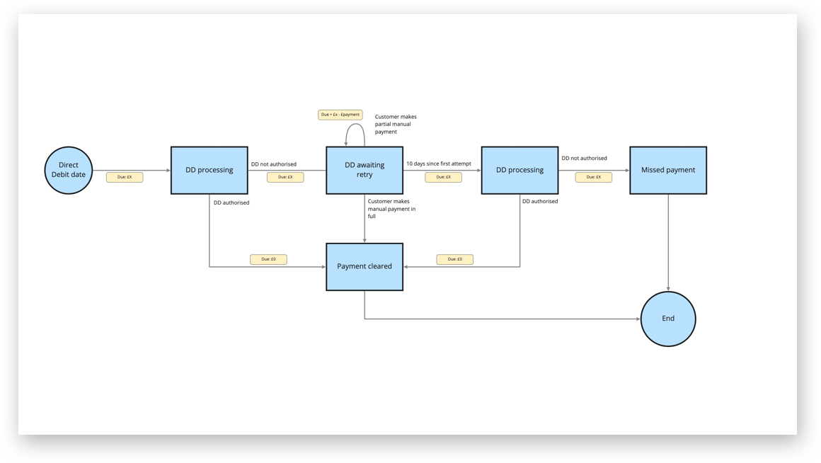
This required delving into and simplifying the processes for how different customer cases are handled.
We considered what we need to measure to determine what a successful experience would be for this project, and agreed on what metrics would be most suitable:

Everything we knew, and wanted to know, was captured in the form of insights, questions and assumptions.
Hypotheses were then created, that could be validated or invalidated during testing.
Test findings, new insights and opportunities were then recorded, which could feed into further actions.
By capturing all these items in a structured grid, we had a single source of truth, and a clear indication of what we needed to do next:

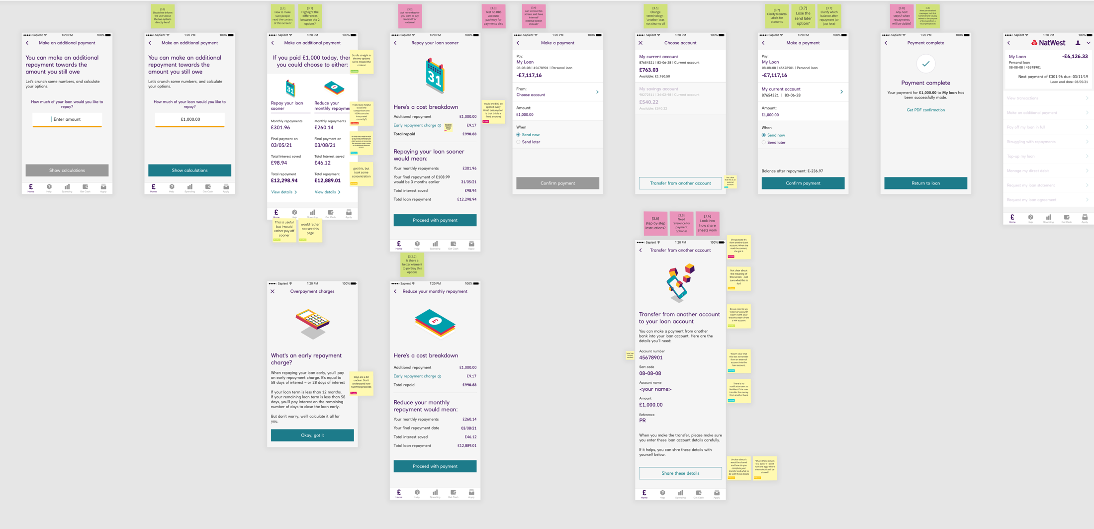
Designs progressed from simple wireframes with which we could run concept testing...
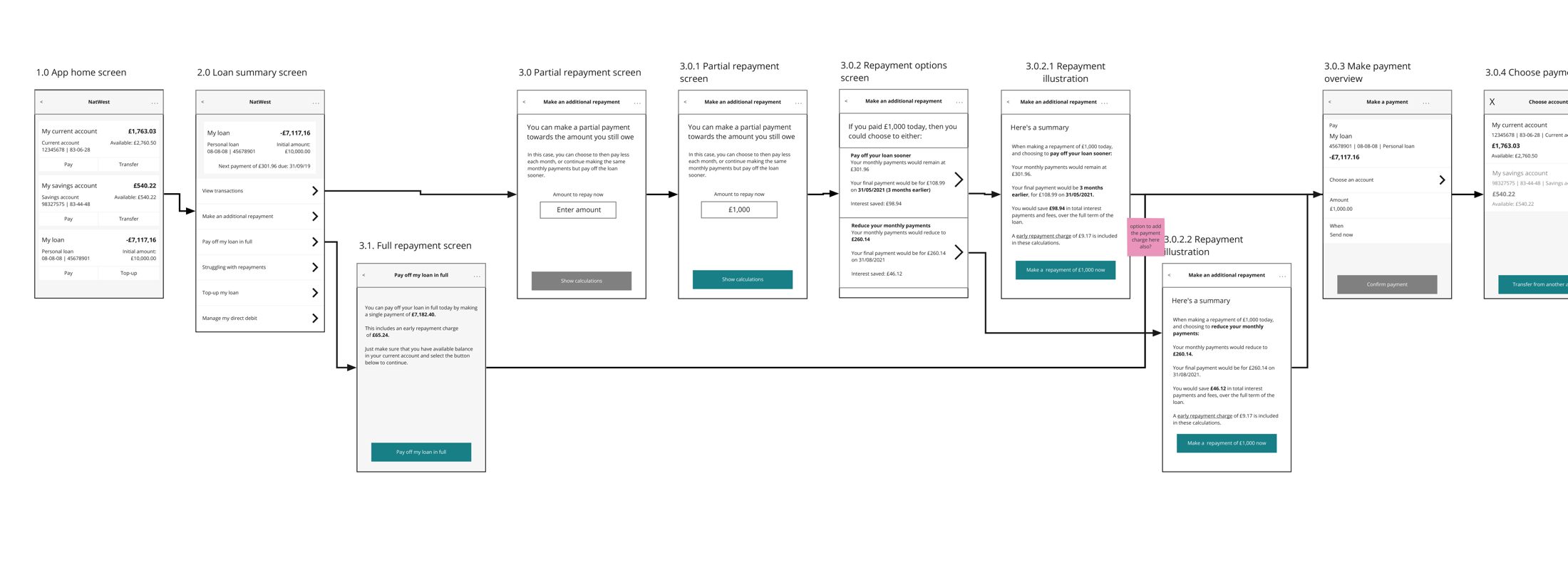
...iterating through more detailed designs...
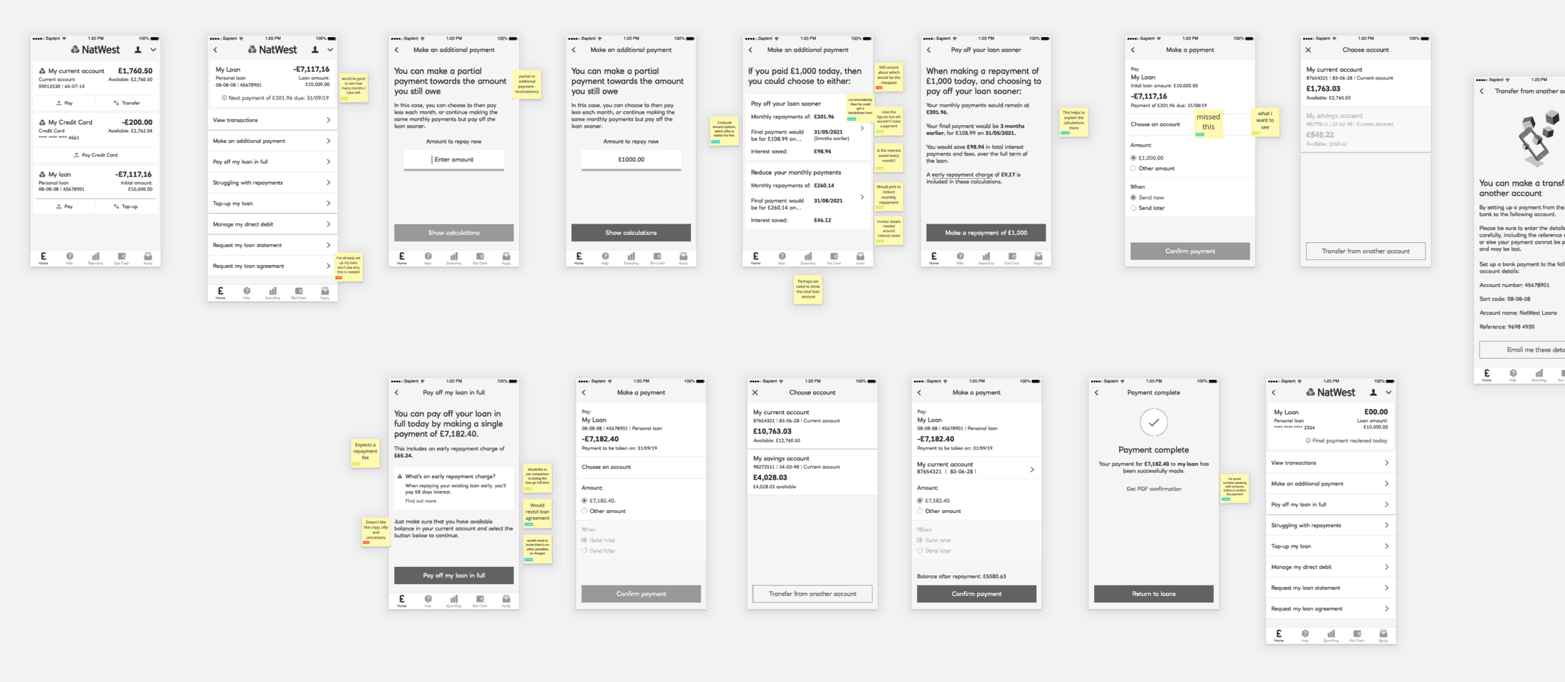
...ending up by usability testing a full fidelity prototype:
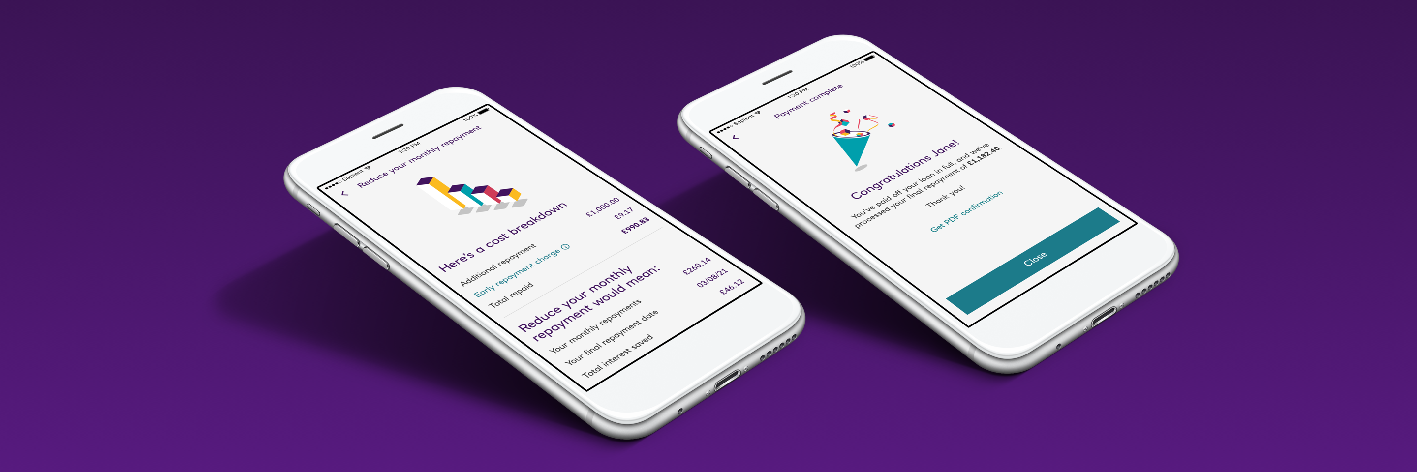
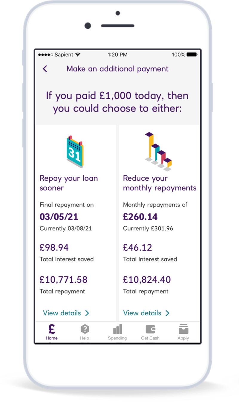
Clear and transparent illustrations help customers make the best decisions for their situation:

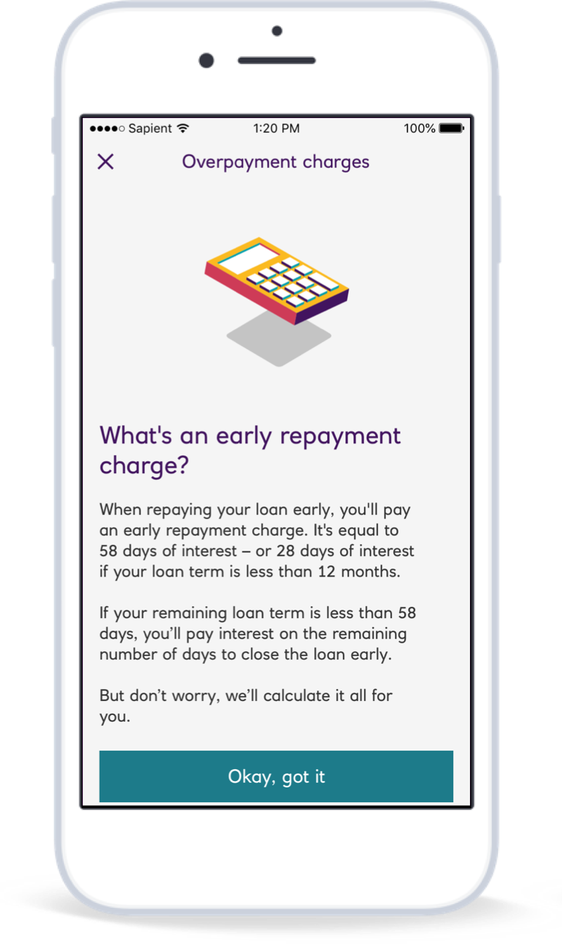
...with in-place explanations of what different terms actually mean:
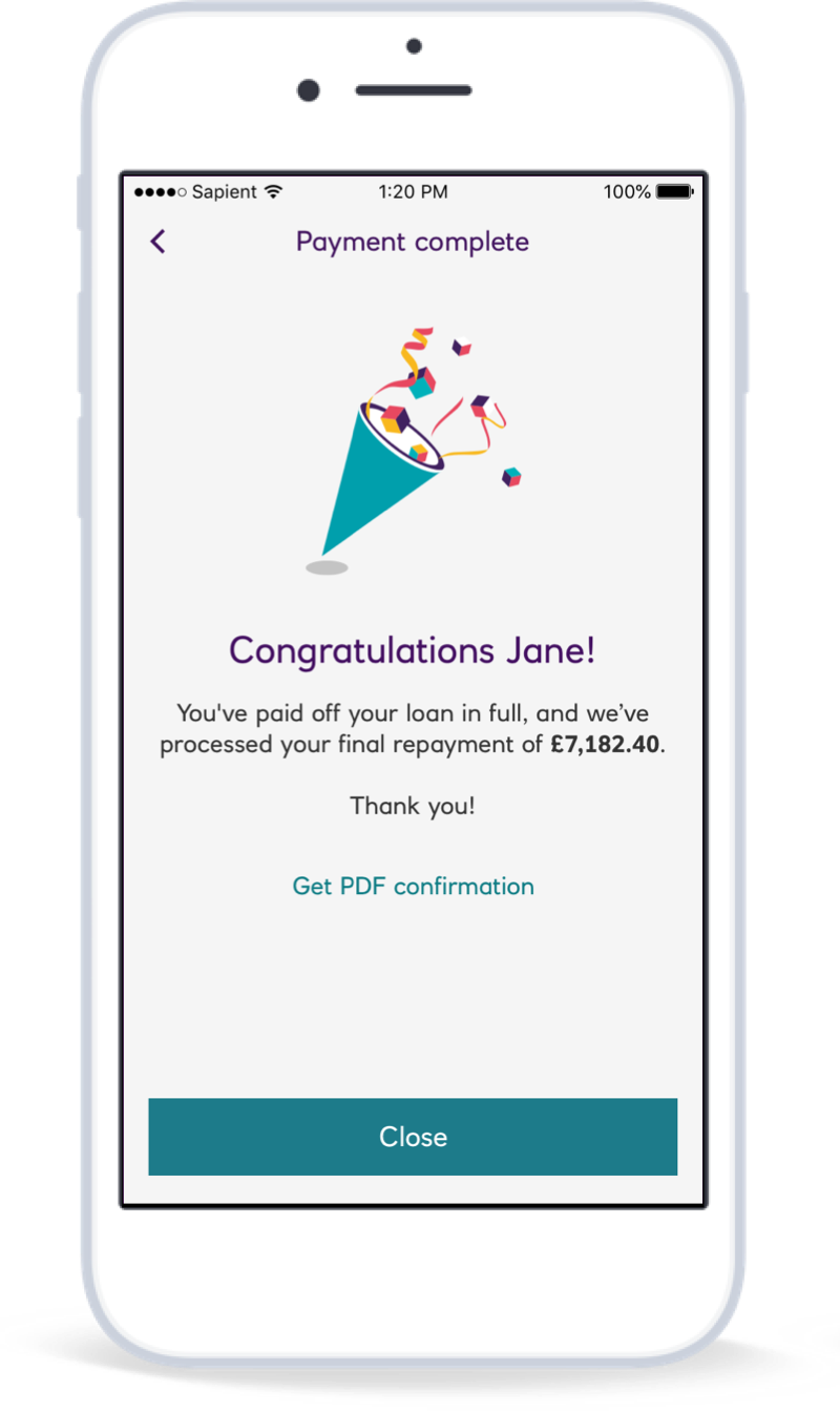
Celebrating big moments and achievements with the customer created a noticeable difference in perception:
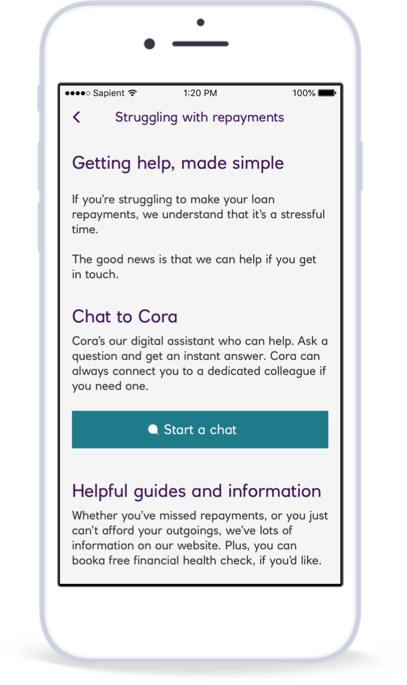
Whilst clear signposts and support for customers in need also had a big impact:
